Discord
Transforming the navigation experience of the largest messaging platform for gamers
Overview
Discord is a popular and versatile communication platform. Originally designed for gamers, it has evolved into a thriving social space for various communities. Despite its success, users often find its interface overwhelming and navigating through servers and channels cumbersome.
My goal with this project was to come up with an improved navigation system, increase the discoverability of features and give Discord a more modern look while retaining its personality.
Tasks
Research, Interaction Design, Visual Design, Prototyping.
Context
The problem
What are users saying?
By diving into Reddit and Discord's Feedback website I found that both new and experienced users often struggle with Discord's interface due to its numerous features and dense layout. I chose three common complaints on which to focus my attention:
An inconvenient server navigation that only becomes less useful as users join more servers.
An abundance of options, functions and settings that are difficult to find.
An interface that feels dated and overwhelming due to the information density and overall design language.

Understanding the platform
The important question
Who is using Discord?
To understand how these problems affect users, I first needed to identify who these users are. Existing research divides Discord’s user base into several categories based on their primary activities and use cases.

Estimated
Designing for code
To get more context about the intent of certain features — and to help me with some design decisions along the process — I also went behind the scenes to analyze Discord's DOM at a deeper level.
By understanding the layout, I can ensure that design changes, when possible, fit the framework, reducing engineering overhead by making them easier to implement without major rebuilding.
Understanding the intricacies of the layout also helps anticipate potential technical challenges and fosters more effective communication with developers, leading to a smoother collaboration.
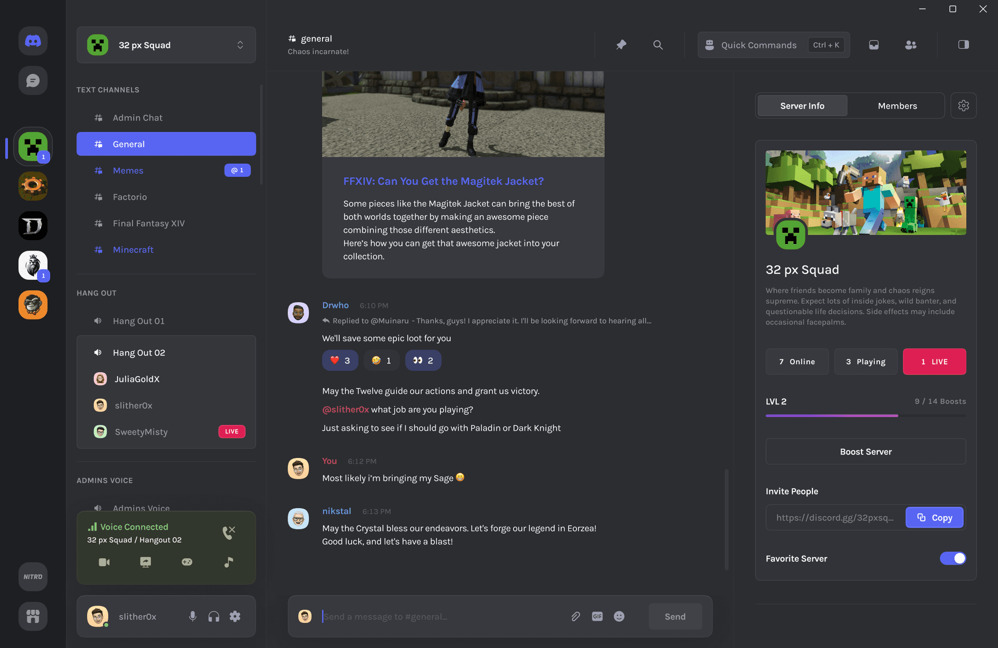
Server Navigation
Let's find a better way
The starting line — current state
The current implementation displays servers as icons on a vertical list, introducing a few usability issues:
The absence of server names makes it challenging to locate less frequently visited servers.
Even if users become familiar with the icons, a server changing its icon can leave users lost.
The current folder system exacerbates the issue by shrinking the icons and — when holding more than four servers — further obscuring them.

Iterating, iterating, iterating
My first iteration was focused on preserving the interactions users were already familiar with while adding an option to expand the list, revealing server and folder names.
This approach, however, didn't add much in terms of convenience or organization, leading to a second iteration in which I shifted to a more traditional list view, focused on organization and the ability to emphasize favorite servers.

The names made it easier to find specific servers.
It maintained the same feel as the current navigation.
Didn't add too much convenience besides displaying the names.
It used too much screen real estate.

A highly effective interaction model for organizing servers.
A separate section for favorites proved very convenient for quick access.
Having two lists side by side was causing a high cognitive load.
This one also used too much screen real estate.
Third time's the charm
The final solution merges the strengths of both previous iterations, addressing the main issue of screen real estate while preserving user familiarity.
The dropdown menu — now the primary navigation — lists all servers and allows users to categorize them into groups.
The server sidebar remains mostly unchanged but now serves as a space for quick access to favorite servers.

Final server navigation
The three designs were prototyped and tested with users. The third solution received the best score in terms of user satisfaction.
But what to do about lots of servers?
I still wanted to simplify navigation through a long collection of servers.
Adding a search box not only made finding servers easier but also allowed me to make one of Discord's lesser-known features more prominent for users — quick server switching.
Although Discord already has a similar feature, it is hidden in the Direct Messages page. Research showed very few users knew about this feature.
Integrating the search box directly into the server list guarantees visibility and makes it a more intuitive feature, ensuring all users can easily access and utilize it.

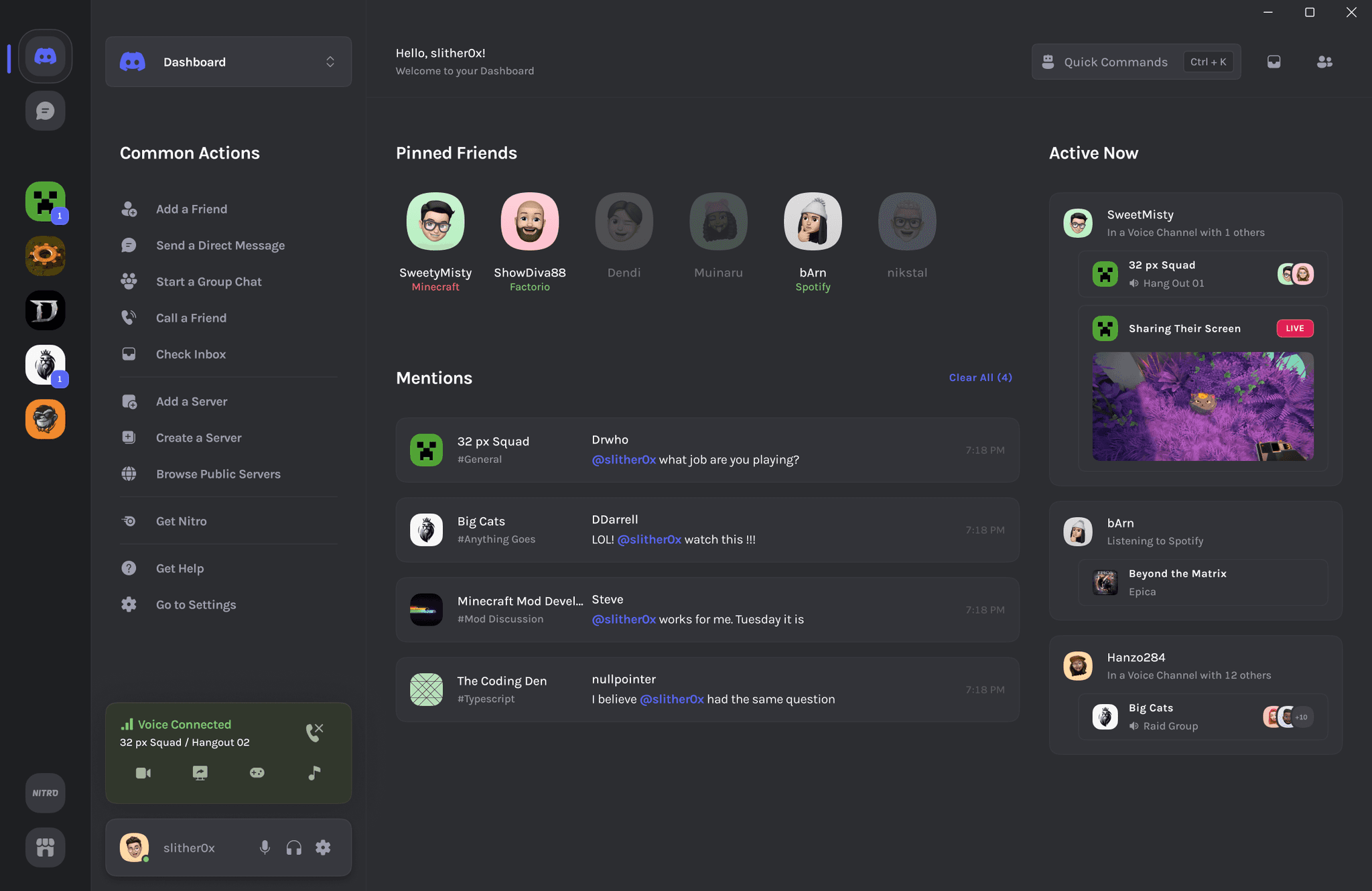
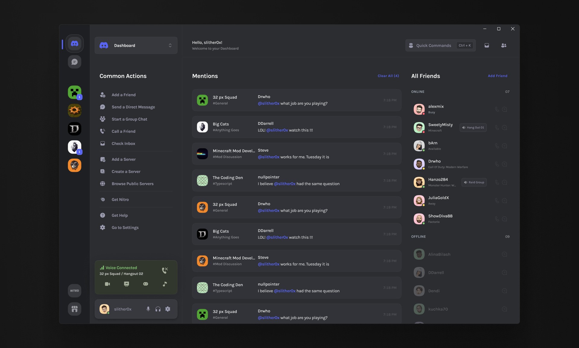
Home page
A New Home
Trouble right from the start
Every time Discord launches, users land on the "Direct Messages" page, where a mix of different content can overwhelm them right from the start. What if we used this moment to present more relevant information that intuitively guides users into the rest of the app?
Inefficient and inconsistent navigation. While Discord's navigation typically occurs on the left side, the presence of a top tab bar here is an inconsistency not found elsewhere.
A list of direct messages that feels more like a friends list, especially when the heading scrolls out of view.
The friends list takes up more horizontal space than necessary, which could be utilized more effectively.
A summary of your friend's current activity. This we can actually keep.

Building a more engaging home
I started by moving direct messages to a separate page, allowing the homepage to better highlight important updates, activities, and frequently used features, helping create a smoother experience each time the app is launched.
Users would get more useful information at the start of each session, helping them quickly decide where they want to "jump" to and boosting their engagement with the platform.

To determine what to include in the Common Actions list, I consulted with users and went back to Reddit and the Discord community to identify the recurring questions from newer users.
Making it modular — and customizable too
Different users have different needs, especially with a userbase as varied as Discord's.
Taking a modular approach when rethinking the home page would provide a few key benefits:
Personalization. Users can tailor their dashboard to match their needs and preferences.
Scalability. The design adapts easily to new features, allowing the platform to evolve seamlessly.
User ownership. Enhances users' sense of ownership and satisfaction with the platform.

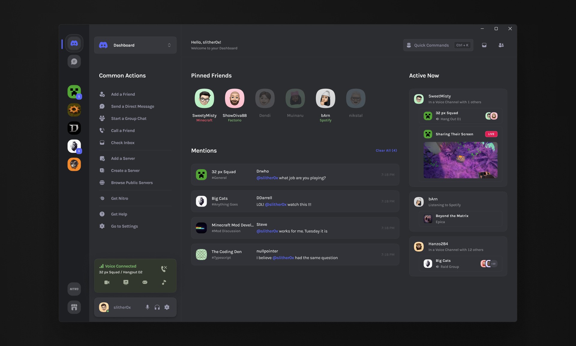
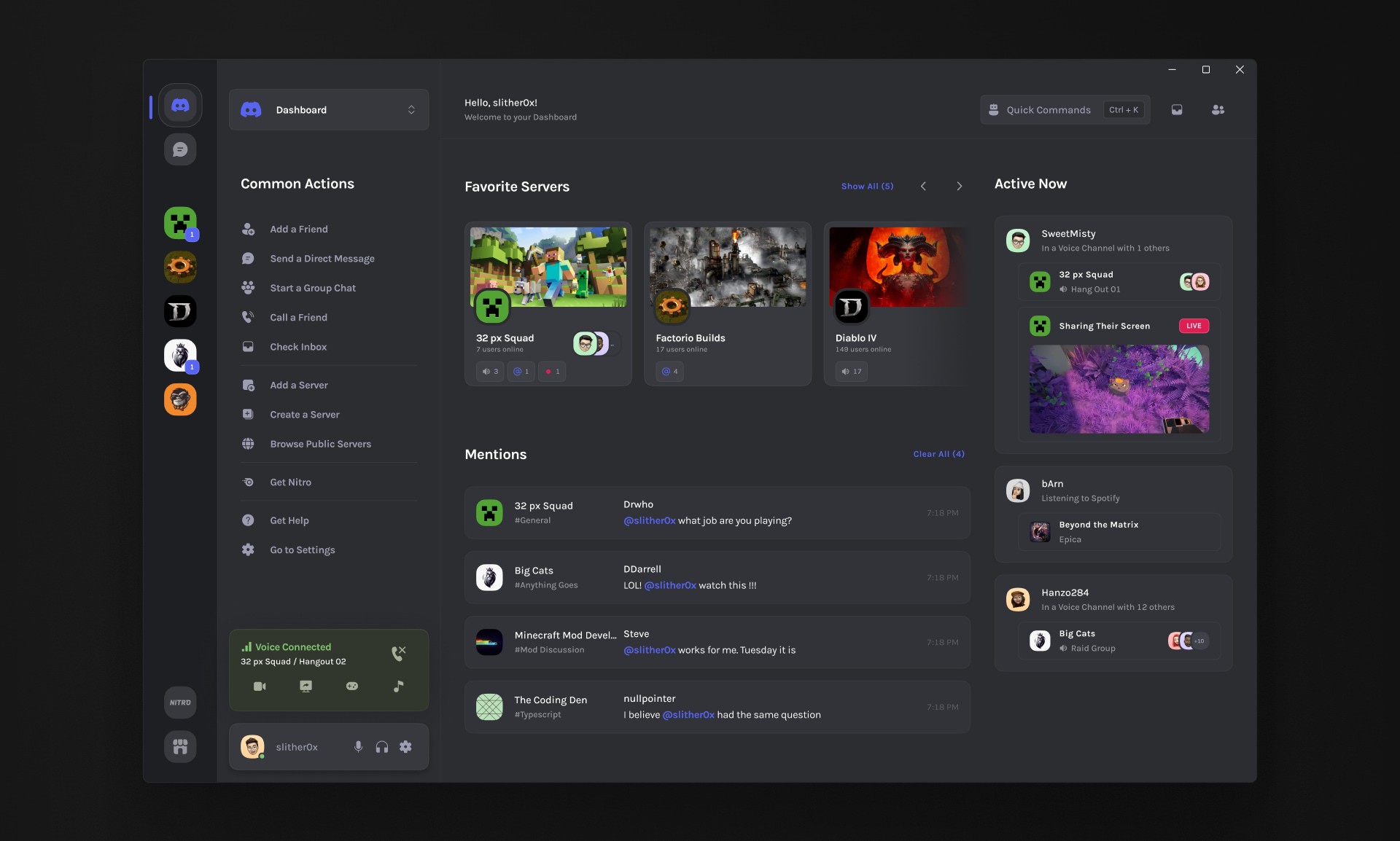
Other renovations
The Nitro subscription and the Shop are essential for Discord’s revenue. By moving them to the sidebar, we can increase their visibility without compromising the user experience.

Discoverability of Features
There's lots of them — so lets make them easier to find
Discord's strength is also its weakness
The abundance of customization, settings, and features can lead to frustration as users struggle to find the tools they need. What if we could make everything searchable?
Discord has hundreds of options which can be intimidating to both new and seasoned users.

Quick commands — Feeling lost? Search for it
When looking for a specific feature, users usually have a general idea of what they want to achieve. By introducing a global search function, users can quickly find what they need without going through long lists of options or menus.
By being context aware it always offers the most relevant results.

Visual Design
A fresh coat of paint
Hmm, let's see...
Analyzing Discord's UI in more detail uncovered several challenges that aligned with users' sentiments of a cluttered and dated interface:
Text overload. Too much text crammed into limited space and text lines that are too long, making them uncomfortable to read.
High information density. Visual overload caused by too many elements on the screen.
Inconsistent design language. Lack of uniformity in the use of spacing and color.

Working on the visual design of an already mature product comes with it's own caveats. I always focus on maintaining the personality of the product while making small but meaningful changes that can be easily implemented.
Spacing, color and size — It's about the small details
I leveraged whitespace to enhance the visual hierarchy, while refining color and sizing of elements to streamline the interface and guide users' attention more effectively.

Bits and pieces
I redesigned every element from the ground up. Establishing a design system ensured consistency and helped me quickly propagate changes while prototyping ideas.

Final Design
A more refined communication platform
New, yet familiar


Conclusion
The finish line
So what happened?
Through this redesign, my goal was to address some of the most common issues reported by Discord users. By taking a modular approach, I wanted to create a design that remains familiar while being expandable and adaptable for future features. These changes aim not only to satisfy users but also to significantly enhance their engagement and satisfaction with the platform. The redesign provides a more intuitive experience, accommodating diverse needs and laying a solid foundation for ongoing improvements.

Feedback during testing
"I love that the discord page [home page] can be customized."

Feedback during testing
I'm always searching though menus so I'd love to have that [Quick Commands feature].

Feedback during testing
"The separation of DMs [Direct Messages] from the main page makes sense. Every time I looked at them I thought for a second that was my friends list."

Feedback during testing
"I didn’t even know about the quick server switching feature before…"
Not everything was perfect
I also received valuable critical feedback that highlighted areas for improvement, opening the door to further exploration and refinement.
Feedback during testing
“The search box is useful, but it took me a bit to notice it.”
Feedback during testing
"It would've taken me a while to understand that servers are now in this menu."
Key takeaways
Design is an ongoing journey
No solution is ever perfect. Continuous iteration and feedback are essential for evolving the user experience.
Research can take many forms
Platforms like Reddit and feedback communities can be excellent tools for gathering information that offer very authentic user feedback.
Informed decisions — the best decisions
Platforms like Reddit and feedback communities can be excellent tools for gathering information that offer very authentic user feedback.