Discord Exploration
Transforming the navigation experience of the largest messaging platform for gamers


Overview
Discord is a popular and versatile communication platform. Originally designed for gamers, it has evolved into a thriving social space for various communities. Despite its success, users often find its interface overwhelming and navigating through servers and channels cumbersome.
My goal with this project was to come up with an improved navigation system, increase the discoverability of features and give Discord a more modern look while retaining its personality.
What I Did
Starting Out
Gathering Research
To better understand the main issues faced by the users, I gathered information about their frustrations and desires from Discord's Feedback website, Reddit and by interviewing 3 daily users of Discord.
Three Pain Points
I decided to focus on three of the most common issues that came up during my research.
Researching Usability
By asking interviewees to complete tasks on the app while verbalizing their thoughts I was able further analyze and understand where users were struggling the most.

"Just the fact that you have to navigate servers by icon rather than by name is immensely frustrating to me."
Starting Out
Designing for Code
I always design with code in mind so diving into Discord's DOM and analyzing its structure allowed me to work as much as possible with what was already there. Following this approach makes sure the end product is easier to implement. It also served as a way to stick to the scope of the project and to challenge myself into coming up with creative solutions.
Designing
Rethinking navigation
Once the user joins many servers, navigating between them becomes complicated. With the current grouping system many of the servers become obfuscated and difficult to find. My goal was to make two key changes without radically changing the current navigation system users have become accustomed to:
Display server names instead of relying on just the icon to identify them.
A group of favorites for quick access to most visited servers.
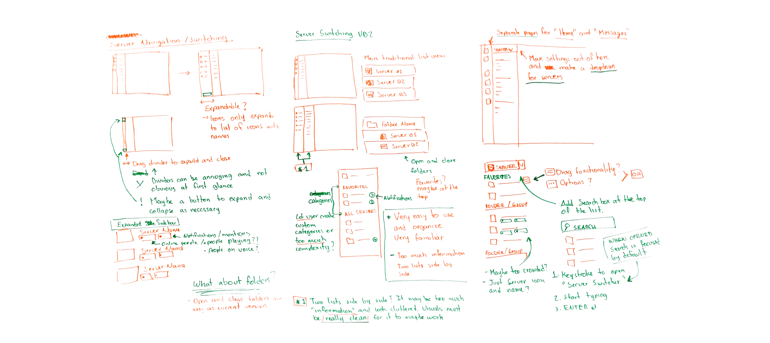
Exploring different approaches
Different variations of navigation were explored. I built high fidelity prototypes and performed user tests to help me identify what worked and what didn't.

The two main issues I ran into when exploring ideas were screen real estate and the information density from having two lists side by side. This added a lot of visual clutter and a layer of complexity from having to open (expand) and close the list view.
The solution
By combining concepts and ideas from both versions, I came up with an interaction that was familiar and kept space usage to the minimum. Another round of user testing showed this was the favorite design among the interviewees.
Servers Dropdown
All servers are stored here where they can be organized into categories. A search function makes it easy to find the one you're looking for.

Favorite Servers
Most accessed servers can be pinned to the left for quick access.
Designing
Improving Discoverability
To enhance the discoverability of features, I decided to take a three step approach that focused mostly on improving the information architecture:
Give users quick access to their most used information and actions.
Consolidate server information, tools and settings into a single organized location.
Give users the ability to search for any particular setting or action.

Reworking the Home Page
A quick and simple way for the users to complete the most basic actions, interact with their close friends and see what’s happening at a glance.

Quick Commands
Search for any action or setting. By being context aware it always offers the most relevant results.

Server Sidebar
Access the server's bio, members, activity and settings from one place.


Designing
UI Redesign
The main issue with Discord's current UI lies on how cluttered it feels. Design inconsistencies and an insufficient use of spacing and hierarchy make for an interface that can feel flat and uninteresting. My approach to fixing this involved three goals:
Improve spacing and hierarchy to increase readability and reduce visual clutter.
Use of color to emphasize important information and to add visual interest.
Improve the overall consistency of the visual language.
Every measurement is aligned to a 4-pixel grid, bringing harmony to the design and simplifying development

The Result
Final Design

Extras
Bonus: Custom CSS
I modified Discord's UI using custom CSS to get it as close to the final design as possible. Although this approach did not allow for adding new functionalities it enabled me to experience some of the design changes during regular usage.