FileHub
Boosting collaboration by creating an in-house file management tool


Overview
As part of the design team for a business incubator, we frequently worked with multiple brands, each with its own unique style, guidelines, and assets.
Accessing or sharing these files was done through various platforms like email, Google Drive and Microsoft Teams. This not only led to inefficiencies but was also prone to mistakes.
Contribution
UX Designer — Interaction Design, Visual Design, Design System, Dev Handoff.
Timeframe
5 Months
Context
The problem
It had to be simple to reduce onboarding and because clients would also have access to it.
It had to be smart so it could automate certain tasks like naming and sorting.
It had to plug-in into our workflow by adding convenience, not complexity.

Designing
By talking to members of all teams — designers, developers, project managers and members of the marketing team — and clients, we were able to identify the most common issues they were having. We narrowed them down to three key points:
Keeping track of files scattered across email, Microsoft Teams and Google Drive led to inefficiencies in file access and an increased risk for making mistakes.
Usage guidelines for specific cases or particular assets were missing or not easily accessible.
Emailing files back and forth when collaborating with other team members.


Designing
Giving it form — establishing the foundation
We brainstormed many ideas which we then evaluated together with the development team by scoring each one on their impact vs the effort required to develop. This guided us towards our initial feature list.
This gave us an extra layer of tools and information which was not really needed for clients who only needed access to a single brand's assets.
In our first iteration, we aimed to maximize the use of available space, taking cues from other cloud storage and file-sharing services. However, early internal feedback revealed that this approach reduced scannability.
For our second iteration, we decided to limit the maximum content width. After testing popular web breakpoints, we settled on 1200px, which struck a good balance between space utilization and readability.


We wanted the platform to be more engaging than a traditional list of files and folders. So, we designed a layout that was visually appealing and customizable for each brand, all while maintaining usability.
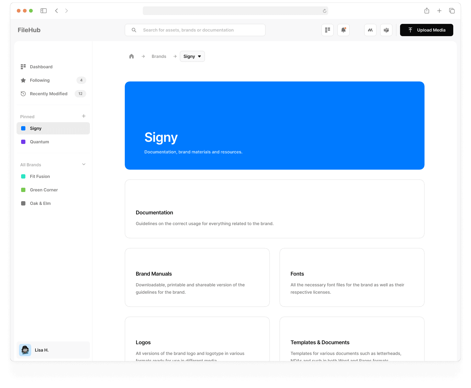
By introducing a colored header, the platform felt like it was custom built for each brand.

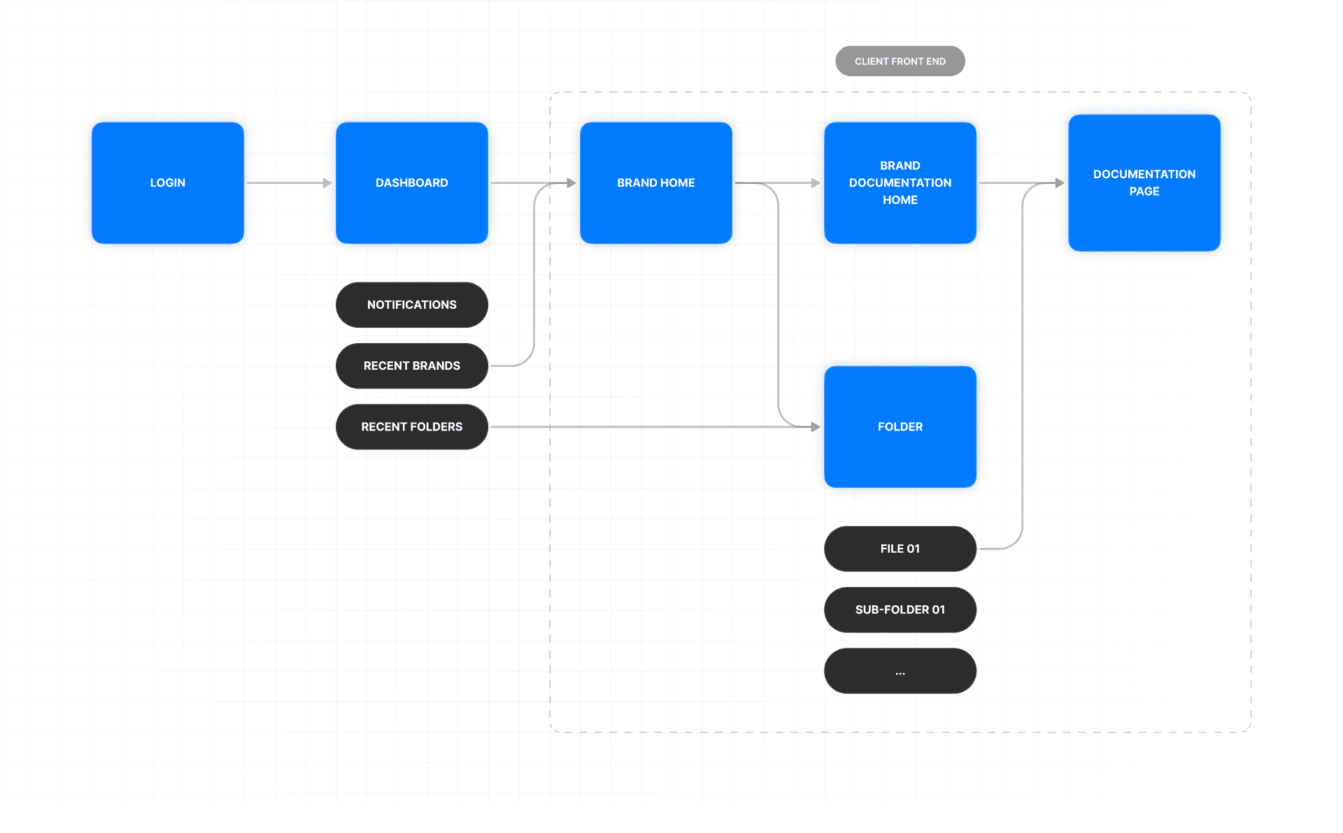
We separated the front-end into two. An internal version with all the tools required for managing each brand, and a simplified client-facing version which was limited to read and download only that felt more like a personalized repository.
Main Front-End
The more robust — yet simple — internal version had all the tools required for managing each brand.
The name of the brand the file belonged to. This was usually upfront.
The asset type was usually included. This could be used not only for naming but also to decide where to save the file.
Client Front-End
A simplified version made the client-facing variant feel like a personalized repository that was easy to use.

Feels more like a personalized repository or website
The asset type was usually included. This could be used not only for naming but also to decide where to save the file.
Designing
File-naming — keeping it clean and consistent
Our goal was to find a way to organize and name files neatly without requiring everyone to memorize a set of rules.
I started by analyzing hundreds of files to see how everyone was naming their documents while looking for patterns and common practices.
I noticed that most file names generally had four main parts, and that there was important information we could gather from each of them:
The name of the brand the file belonged to. This was usually upfront.
The asset type was usually included. This could be used not only for naming but also to decide where to save the file.
Additional words or identifiers which could be used for context or as metadata for the file.
The file extension which would dictate what download options were available.

While exploring how to handle these patterns, I came up with the idea of storing them in a dictionary—or, in this case, a JSON object. If new patterns or needs were to emerge, this approach would make it easy to adapt to them.
When a file name was read, the words could be matched to the entries in our JSON object to determine what was relevant, where it should go and what could be ignored.
I presented this idea to the dev team. They were happy. 😄
Instead of having the users adapt to the system, we had the system adapt to the users.

When a user uploads a file, the system takes the information from the file and uses it to prefill relevant fields. This helps sort the asset into the correct brand and folder, and generates a clean file name based on our established naming conventions with minimal manual intervention.

Everything autogenerated was editable. This made sure we co
In order to proceed to the next step in the upload process all relevant fields needed to be filled. This meant even in the worst case scenario where an uploaded file was lacking any relevant information the final asset name would be clean.

Designing
Additional features — added convenience
Our goal was to find a way to organize and name files neatly without requiring everyone to memorize a set of rules.
I started by analyzing hundreds of files to see how everyone was naming their documents while looking for patterns and common practices.
I noticed that most file names generally had four main parts, and that there was important information we could gather from each of them:
The name of the brand the file belonged to. This was usually upfront.
The asset type was usually included. This could be used not only for naming but also to decide where to save the file.
Additional words or identifiers which could be used for context or as metadata for the file.
The file extension which would dictate what download options were available.
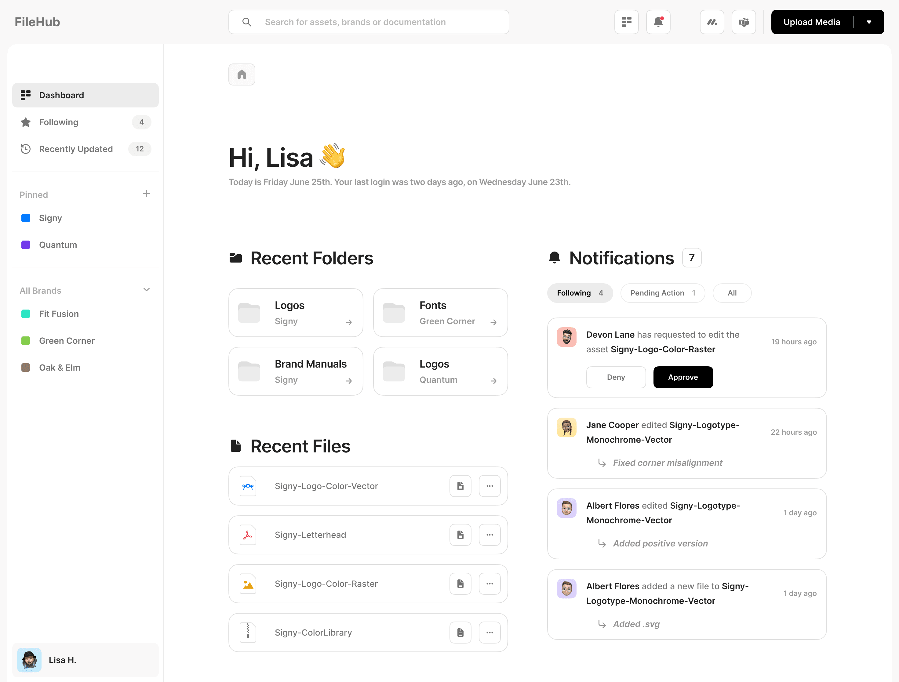
Version Control
Enables rolling back to previous versions and ensures everyone stays up to date with the latest changes.

Quick Access to Documentation
Every asset is linked to its usage rules & guidelines to ensure consistency across all projects.


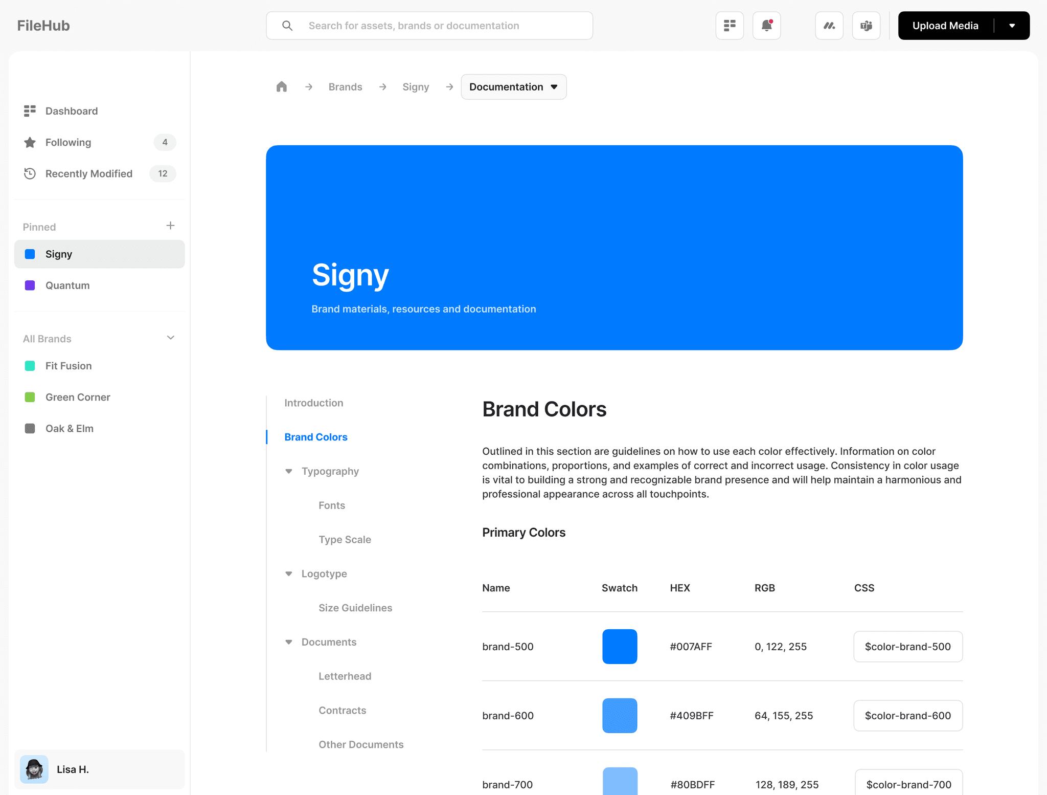
One Source of Truth
A centralized and detailed guide on how to use every single asset for a particular brand. Fonts, colors, logos, how and when to use certain documents; everything was here. We even included direct links to assets within our Figma files.
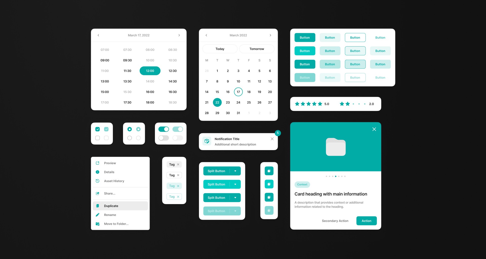
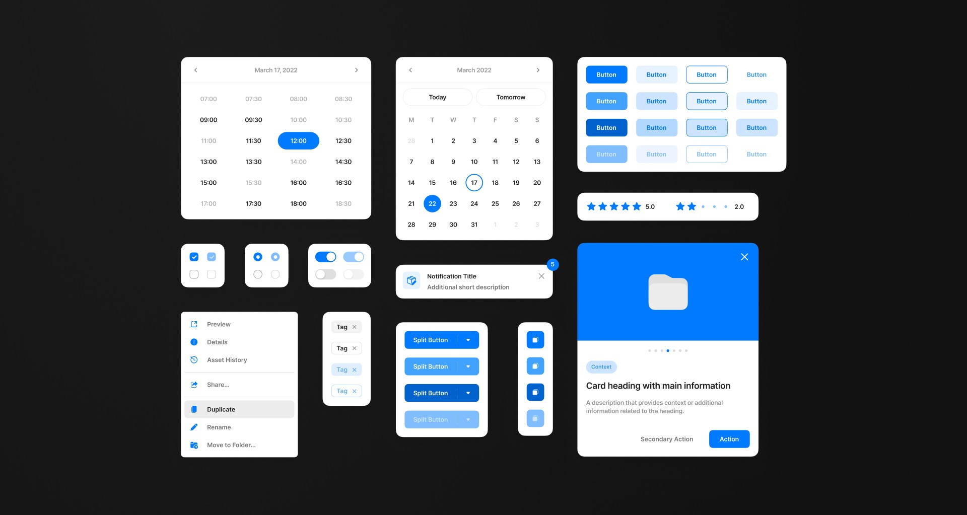
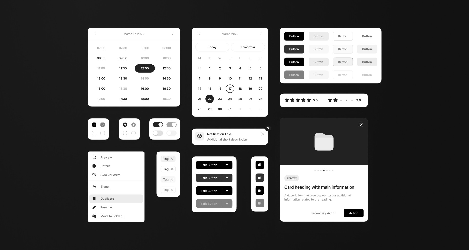
Design System
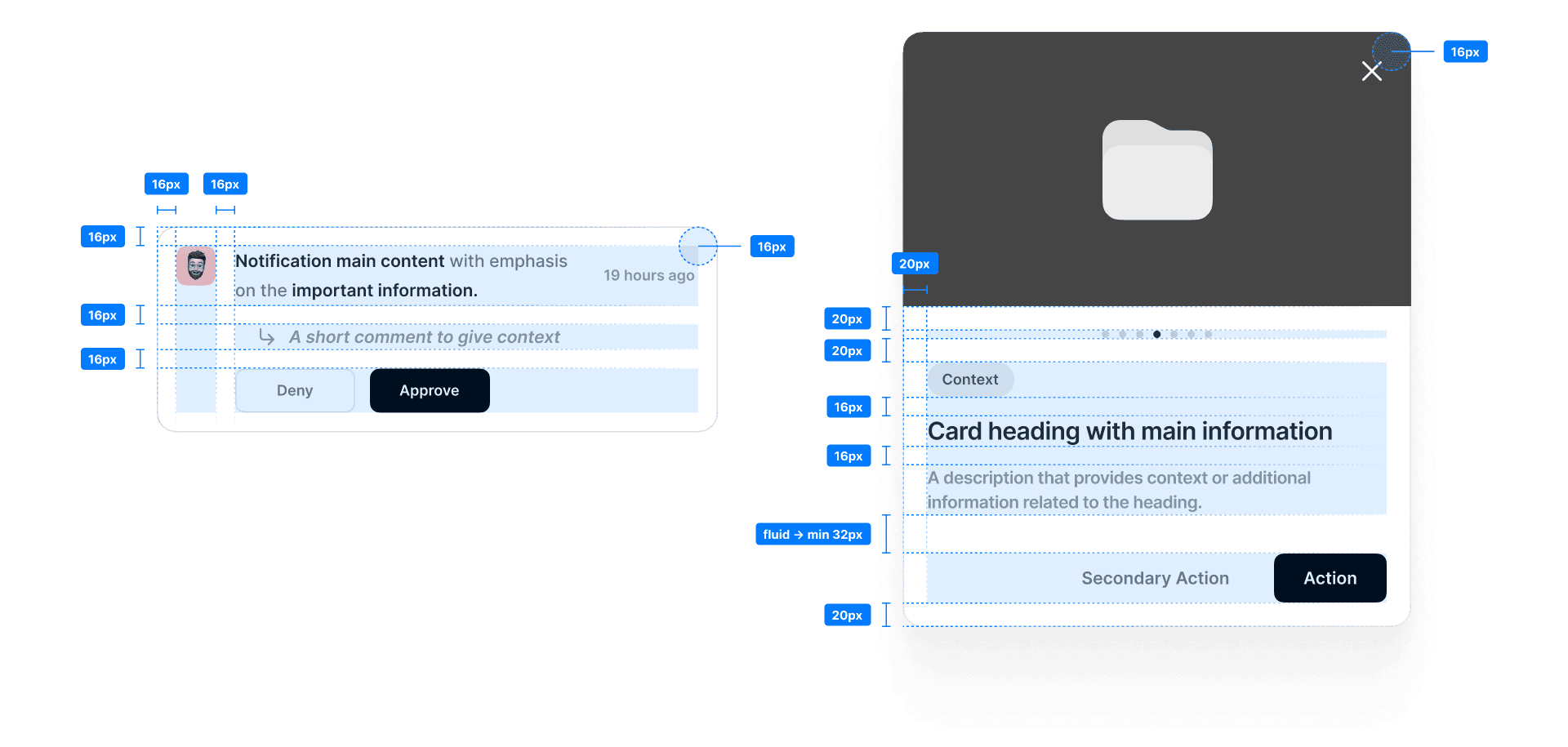
I was responsible for creating, maintaining, and evolving the design system for the project. It began as a collection of components tailored specifically for the project's needs. However, it soon evolved into a comprehensive framework that became the basis for our future tools and projects.
Adaptable and customizable. So it could be used on multiple projects.
Based on tokens to ensure consistency and to make it easy to maintain.
Carefully Crafted with Attention to Detail
I designed every element — from buttons to cards with a keen attention to detail to ensure a polished and professional appearance. Color, typography, and spacing were carefully considered to create a harmonious visual language that provided a seamless and enjoyable experience.
Adaptability and Customization
I designed components and styles that could be easily customized to fit different branding requirements. The base system was designed in shades of black and gray so that I could focus on contrast, rather than color, to create visual hierarchy.
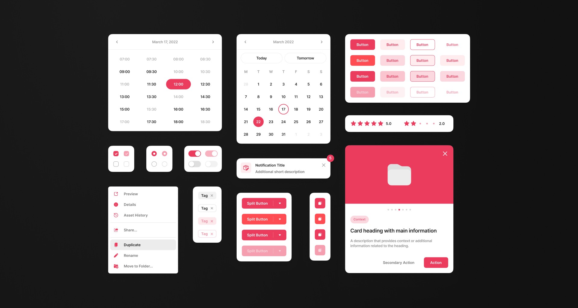
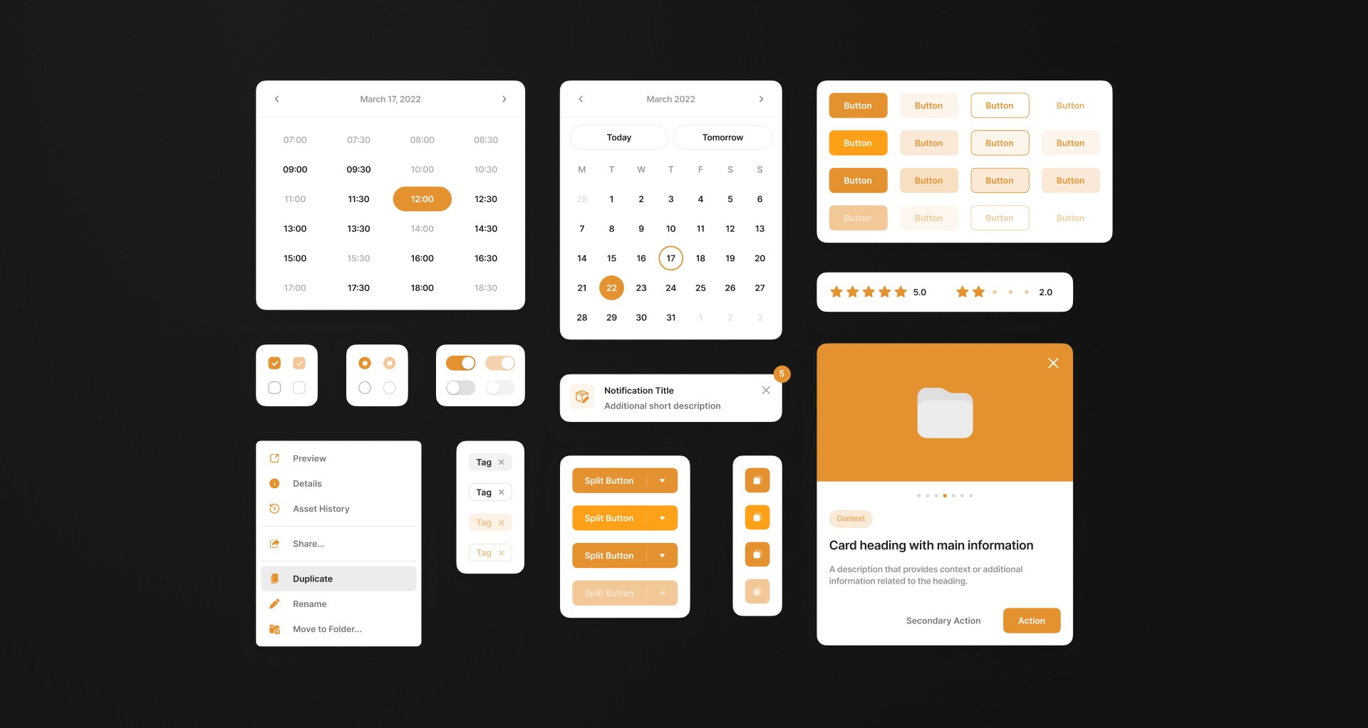
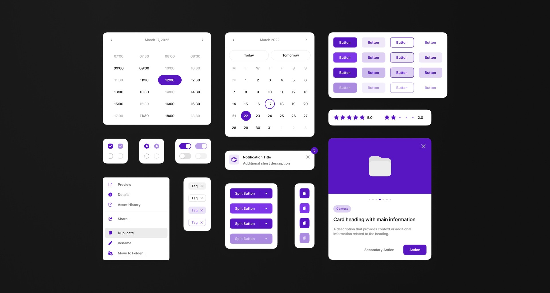
A little tip I learned throughout the years when dealing with colors and contrast is to desaturate your visuals. This lets you analyze them in terms of contrast and contrast only.
Components, Tokens and Structure
I created robust, modular components that leveraged design tokens to ensure consistency and ease of maintenance. Everything was structured in terms of CSS Flexbox and Grid, and named accordingly following conventions established in collaboration with developers. This thorough approach was essential for a smooth handoff process and ensured that the design components were easily implementable in code.

I created robust, modular components that leveraged design tokens to ensure consistency and ease of maintenance.
Everything was structured in terms of CSS Flexbox and Grid, and named accordingly following conventions established in collaboration with developers. This thorough approach was essential for a smooth handoff process ensuring that the design components were easily implementable in code.


The Result